This assignment is ungraded. I encourage you to review the problems to see if (1) you know how to do them or (2) if you know how to google how to do it. If either path forward escapes you, I suggest that you complete this assignment.
Part 1
Create an RMarkdown file to use for this assignment. Use html as the output and change at least one option in the yaml. Complete the rest of the assignment using markdown and chunks to create readable code and output.
Part 2
Using censusreporter.org, pick an American Community Survey variable and a geographic area and division (e.g. nationwide and states, statewide and county, county and tracts).
Using tigris, tidycensus, and leaflet (encouraged, or your favorite R package for maps), map the variable over your chosen geographic divisions. Select an appropriate pallete, and consider adding popup labels. Write a few sentences describing your map in Markdown.
library(tidyverse)
library(tidycensus)
library(tigris)
library(sf)
library(scales)
library(leaflet)

il21 <- get_acs(geography = "tract",
              variables = c(medincome = "B19013_001",
                            totalpop = "B02001_001",
                            white_alone = "B02001_002",
                            black_alone = "B02001_003",
                            asian_alone = "B02001_004"),
              state = "IL",
              year = 2021,
              output='wide')

il21 <- il21 %>% mutate(
  pct_white = white_aloneE / totalpopE,
  pct_black = black_aloneE / totalpopE,
  pct_asian = asian_aloneE / totalpopE
)

iltracts <- tigris::tracts(state='17', year=2021, cb=TRUE, progress_bar=FALSE)

joined <- iltracts %>% left_join(
  il21 %>% select(GEOID, pct_white, totalpopE, medincomeE)
) %>% filter(COUNTYFP == '031') #cook

### make labels

label_str <- str_glue("<strong>Tract %s</strong><br>White Alone (Pct): %s<br/>")
labels <- sprintf(label_str,
                joined$NAME,
                percent(joined$pct_white, accuracy = .1)) %>%
  lapply(htmltools::HTML)

### make palette

pal1 <-
  colorNumeric(
    palette = "Oranges",
    domain = joined$pct_white,
    na.color = "Grey"
  )


m <- leaflet() %>%
  addTiles() %>% addPolygons(
    data = joined,
    fillColor = ~ pal1(pct_white),
    weight = 0.5,
    opacity = 0.5,
    color = "white",
    dashArray = 3,
    fillOpacity = 0.7,
    highlight = highlightOptions(
      weight = 5,
      color = "#666",
      dashArray = "",
      fillOpacity = 0.7,
      bringToFront = TRUE
    ),
    label = labels,
    labelOptions = labelOptions(
      style = list("font-weight" = "normal", padding = "3px 8px"),
      textsize = "15px",
      direction = "auto"
    )
  ) %>%
  addLegend(
    pal = pal1,
    values = joined$pct_white,
    opacity = 0.7,
    title = NULL,
    position = "bottomright"
  )


m
Part 3
Consider expanding the divvy example from class with the following:
- approximate trip distance from start/end location
- show some summary stats by hour or day of week or community area or “rideable” type
- construct a regression with some combination of the above
temp <- tempfile()
download.file("https://divvy-tripdata.s3.amazonaws.com/202107-divvy-tripdata.zip",
              temp)
unzip(temp, list=TRUE)
## Name Length Date
## 1 202107-divvy-tripdata.csv 154040041 2021-08-14 01:42:00
## 2 __MACOSX/._202107-divvy-tripdata.csv 498 2021-08-14 01:42:00divvy <- read_csv(unz(temp, "202107-divvy-tripdata.csv"))
unlink(temp)dist1 <- divvy %>%
slice_sample(n=100000) %>%
filter(!is.na(start_lng)) %>%
rowwise() %>%
mutate(distance = geosphere::distHaversine(c(start_lng, start_lat),
c(end_lng, end_lat)))
dist2 <- divvy %>%
slice_sample(n=1000) %>%
rowwise() %>%
mutate(start_point = st_sfc(st_point(c(start_lat, start_lng)), crs=4326),
end_point = st_sfc(st_point(c(end_lat, end_lng)), crs=4326),
distance = st_distance(start_point, end_point))
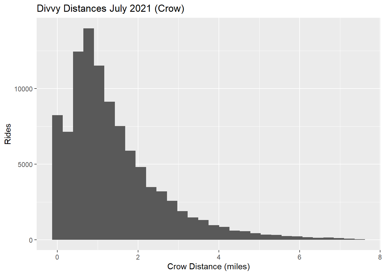
ggplot(dist1 %>%
mutate(distance = as.double(distance)) %>%
filter(distance/1609 <= 7.5), aes(x=distance/1609)) +
geom_histogram() +
labs(x='Crow Distance (miles)',
y='Rides',
title='Divvy Distances July 2021 (Crow)')
Part 4
Grab another variable for the same geographic area and divisions with the intent of exploring correlation between this variable and the one selected in the part 2. Replicate some of the analysis from Tidy Modeling Sec 3.1.
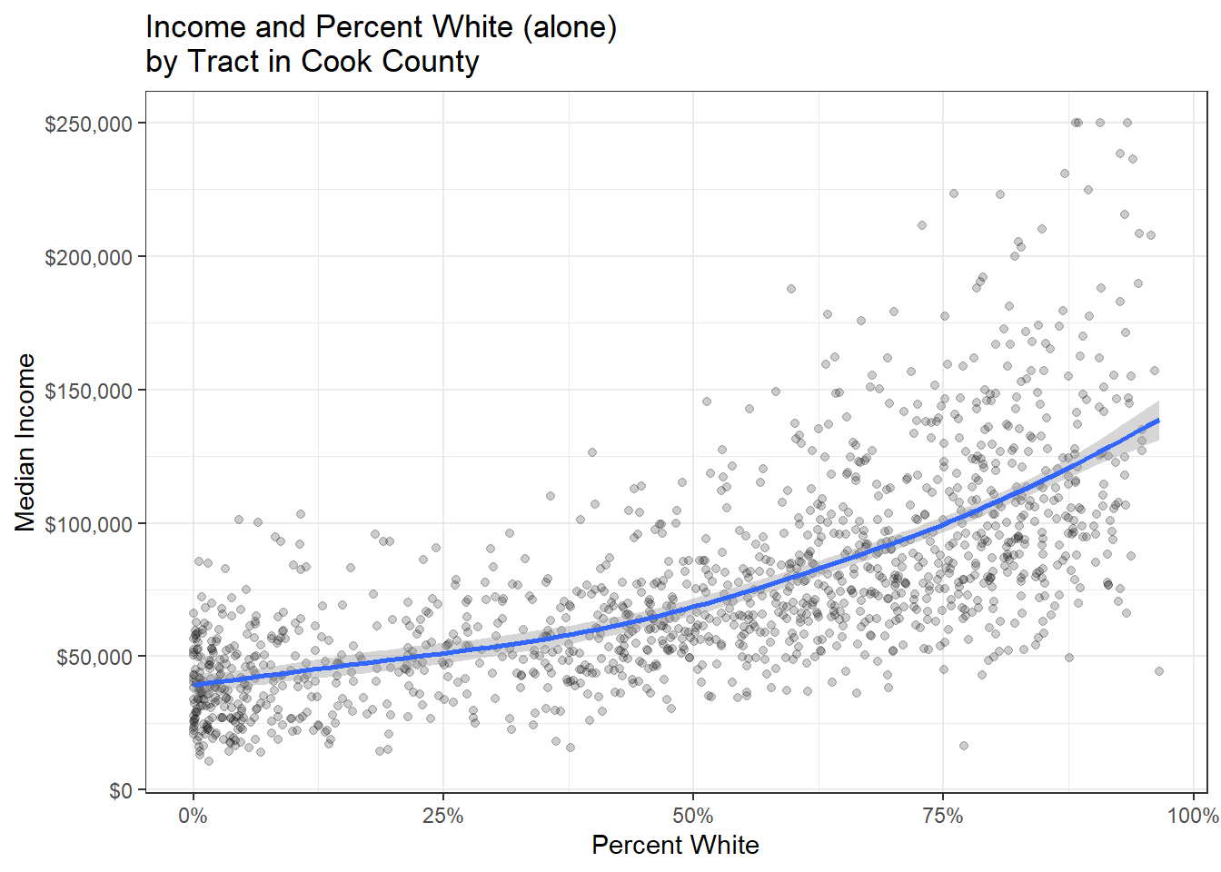
ggplot(joined, aes(x=pct_white, y=medincomeE)) +
  geom_point(alpha=.2) +
  geom_smooth() +
  theme_bw() +
  scale_y_continuous(labels=dollar_format()) +
  scale_x_continuous(labels = percent_format()) +
  labs(x='Percent White', y='Median Income', title='Income and Percent White (alone)\nby Tract in Cook County')
m1 <- lm(medincomeE ~ pct_white + totalpopE, data=joined)

stargazer::stargazer(m1, type='html')| Dependent variable: | |
| medincomeE | |
| pct_white | 91,399.360*** |
| (2,787.468) | |
| totalpopE | -0.095 |
| (0.464) | |
| Constant | 31,554.090*** |
| (2,178.816) | |
| Observations | 1,317 |
| R2 | 0.463 |
| Adjusted R2 | 0.462 |
| Residual Std. Error | 28,881.290 (df = 1314) |
| F Statistic | 566.770*** (df = 2; 1314) |
| Note: | p<0.1; p<0.05; p<0.01 |